This post explores how extreme weather impacts crime rates using data analysis, visualizations, and real-world trends.
How Weather Shapes Crime: A Visual Exploration
If you read the last post, you know I started wondering whether extreme weather actually affects crime. Turns out… it does! But raw numbers can only say so much. The real story came through the visuals.
To bring everything to life, I built a Streamlit app, which is basically a way to turn data into something you can actually interact with. Instead of scrolling through a bunch of static charts, the app lets you click around, filter by crime type, toggle storm days, and see how things shift with temperature. I added tabs, dropdowns, and live-updating graphs so even someone with zero data experience could explore and uncover patterns for themselves.
Lets walk you through some of the visuals that stood out!
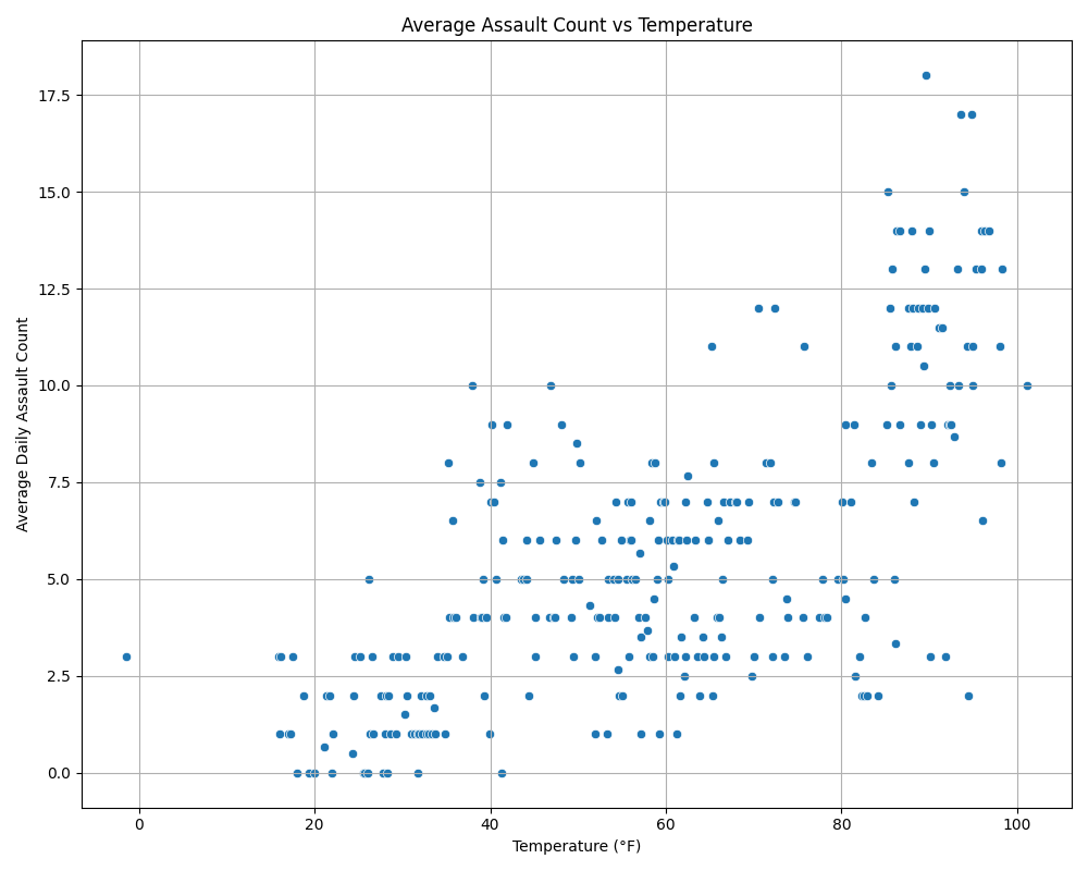
Picture this: It’s late July, the air is heavy, everyone’s sweating through their clothes, and the city feels like it’s on edge. You’ve got sirens in the distance, overheated crowds, long daylight hours. Then the numbers come in: assaults are up. Robberies, too.
People get irritable in the heat. Mix that with crowded public spaces and long summer nights, and… well, the numbers speak for themselves.
But indoor crimes? They keep going. Narcotics offenses, domestic violence, and other indoor incidents don’t seem to care about the weather.
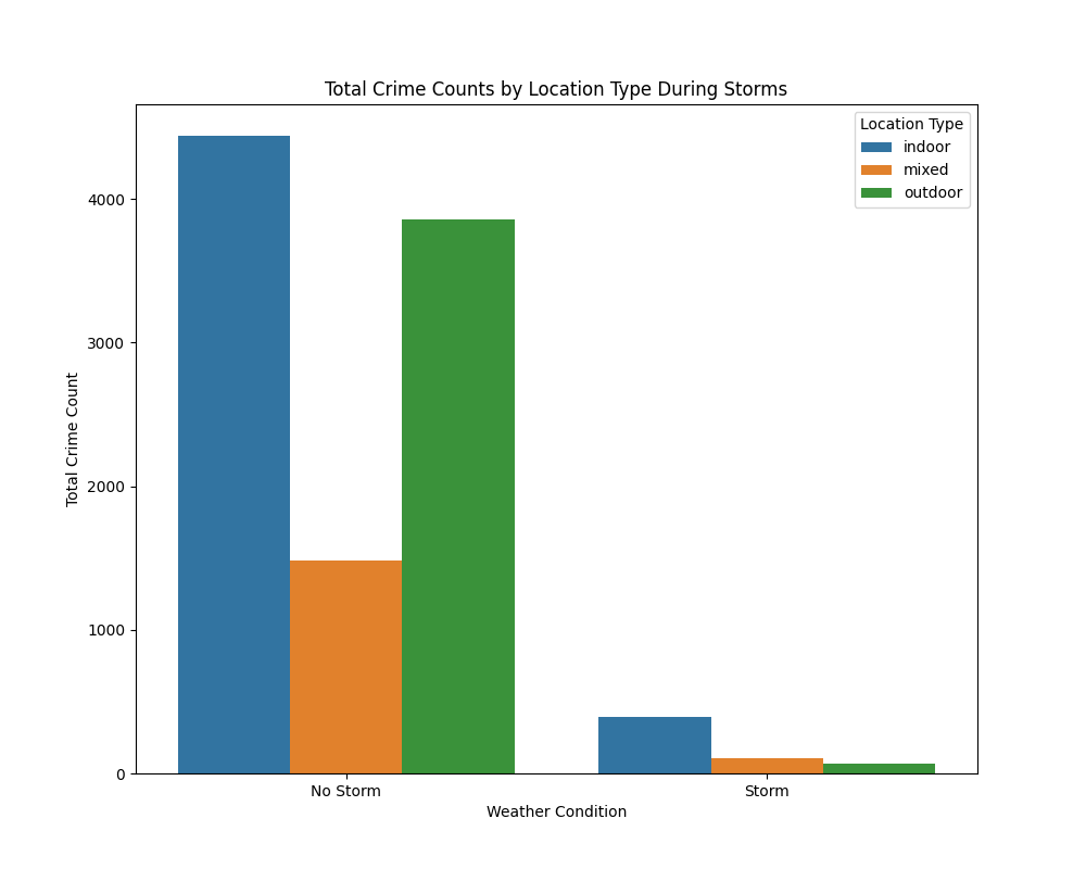
So no, storms don’t stop crime. They just push it indoors. Which kind of makes sense. When the streets clear out, life keeps going behind closed doors.
What surprised me most was how consistent that shift was because it wasn’t a one-off. The storm days were noticeably different every time.
The trend lines are simple but powerful. Robbery climbs in the heat. Burglary doesn’t care much about weather. This feature really helped me think differently about how some crimes are more influenced by the environment than others.
Sometimes I’d pick a crime expecting a pattern and there wasn’t one. Other times, something unexpected would show up, and I’d just sit with it for a minute. It made the data feel personal, like I was learning how these behaviors played out in real life.
Even without reading any numbers, you can tell when crime is at its peak. It gives a seasonal snapshot that says a lot in one quick glance.
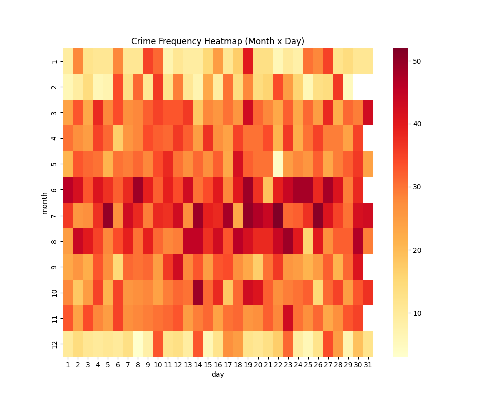
This one was more for fun, but it became one of my favorites. It helped me step back and look at the whole year in one image, and seeing those bursts of color in the summer months made everything I’d noticed in the other graphs feel even more real.
Streamlit honestly made it click. Watching the patterns shift with just a few filters felt less like research and more like discovery.
What started as a small question became a really eye-opening look into human behavior and how the environment around us shapes it.
If you’re curious, the app is live. Try it out. Choose a crime. Slide through the weather conditions. See what stories the data tells you. You might just fall into the same rabbit hole I did.